YouTube has over 2 billion people logging in every month—almost one-third of all internet users! With so many people watching, it’s really important to make your channel special. Creating a cool banner is a great way to do this.
However, the banner should be the right size, so it looks good on all devices. To make this happen, you must follow all the advice provided in this blog. Our tips will help you create a banner that connects with viewers and solidifies your brand on the platform.
By the way, while creating a killer banner is key, don’t forget about managing your channel too! Tools like Social Champ can help you schedule posts, track performance, and collaborate with your team, all in one place.
What’s the Best YouTube Banner Size?
Your YouTube banner, aka “channel art,” is your channel’s first impression, so make it count! It needs to look good on all devices, from phones to TVs.
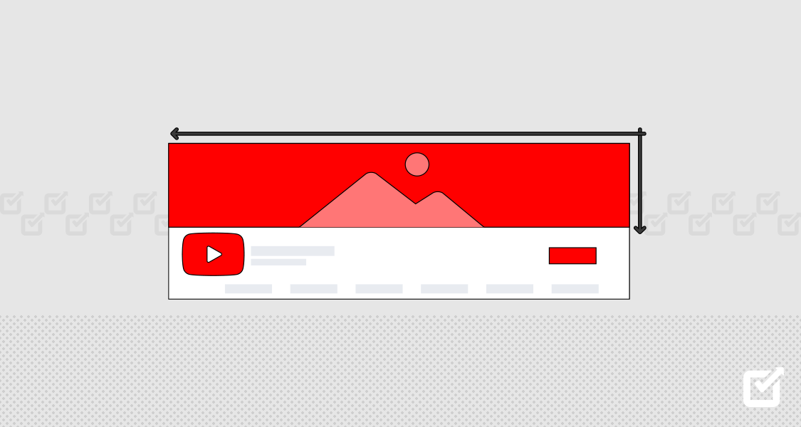
YouTube recommends a size of 2560 x 1440 pixels. This ensures high quality even when scaled down for different screens. Consider it like a high-resolution photo that can shrink without losing detail.
However, this banner has a “safe area” measuring 1235 x 338 pixels. This area is always visible regardless of the device, so keep crucial information like your logo and channel name centered within it. For crisp and clear banners, save your work in either JPEG, BMP, or PNG format. Each has its advantages, but usually, a PNG file gives the sharpest result without a large file size.
Schedule Videos on YouTube With Social Champ
Social Champ’s YouTube Scheduler helps you plan, publish, and manage your content – freeing up time to focus on creating your next masterpiece.
Planning the YouTube Banner Size for All Devices
When you create a YouTube banner size for all devices, you have to consider how it will look on smartphones, computers, and TVs. Here’s what you need to know about YouTube banner size for mobile and YouTube banner size for desktop.
- Computer View
On a computer, you’ll see the whole banner, which is 2560 x 1440 pixels big. But remember, if someone is looking at your banner on a smaller screen, they might not see everything. So, put the most important information in the middle. - Smartphone View
What about the YouTube banner size for mobile? You’ll only see a 1546 x 423-pixel part of your banner on a smartphone. Everything outside this area will be hidden. So, put any important logos or words inside these dimensions. - TV View
Smart TVs display the full banner, including the previously hidden sides. Don’t worry about adding anything special there – focus on crafting a compelling central image or message for optimal viewing on all devices.
How to Add a YouTube Banner
Putting up a banner on your YouTube channel is relatively easy, but you need to think carefully about its design. Here’s a simple guide to help you add a banner.
Step 1: Log in to YouTube
First, you need to go to YouTube and log in using your channel’s username and password.
Step 2: Go to Your Channel
After logging in, find your profile picture in the top-right corner of the screen and click on it. A drop-down menu will appear. Choose “View Your Channel” from the options.

Step 3: Customize Your Channel
When you’re on your channel’s page, look for the “Customize Channel” button and click it.

Step 4: Add Your Banner
A new window will open. On the screen, you will see three folds: Layout, Branding, and Basic Info. Select ‘Branding’ and click ‘Banner Image.’ Select ‘Upload.’

Step 5: Make Adjustments
Once your banner image is uploaded, you can adjust it to see how it will preview on each device. YouTube’s preview tool segments the banner into three components, allowing you to see areas that are viewable on all devices, TVs, and desktop computers.

Step 6: Save Your Changes
When you’re happy with how your banner looks, click “done” and then “publish.” Your banner is now set!
YouTube Banners Size Design Tips
Designing a YouTube banner that grabs attention is both an art and a science. Here are some tips to help your banner stand out.
- Show Off Your Brand
When someone visits your YouTube channel, the first thing they’ll see is your banner. This means your banner should quickly tell them what your brand is all about. It should include things like your brand’s colors, logo, and any other symbols or images that represent your brand. - Guide Your Viewer’s Eye
By using different fonts, sizes, and positioning, you can guide your viewer’s eye to the most important parts of your banner. The name of your channel or title should be the biggest and most noticeable thing. After that, you should highlight any key images or messages. Lastly, any extra text or social media links should be the least prominent. - Match Your Thumbnails
Your banner should look like it belongs with your video thumbnails. When your design elements match across your channel, it creates a professional look that’s easy to recognize and remember. - Keep It Balanced
Avoid cramming too many things into your banner. Instead, use space wisely to create a balanced look. This will guide your viewer’s eye and help them understand your message more clearly. Remember, keep your YouTube banner size according to best practices!
Related Article: 45+ Mind-Boggling YouTube Stats That Are Hard to Ignore in 2025
YouTube Banner Best Practices
Here are some best practices to help you create a compelling YouTube banner:
Get Comfortable with Technology
Most of the YouTube traffic comes from digital devices like smartphones and tablets. Hence, it’s crucial to design your banner with digital viewing in mind. Use high-resolution images to ensure that your banner looks crisp and clear on all screens.
Moreover, readability is key. Your text should be clear and legible, even on smaller screens. Avoid using overly decorative fonts, which may look beautiful but can be challenging to read. Stick to simple, clean typography and ensure the text size is big enough to be easily read on mobile devices.
Maintain Size Consistency
Consistency is the key to professional and attractive visual content. Ensure that your branding elements and text sizes remain consistent across different sections of the banner. This uniformity not only enhances the aesthetic appeal of your banner but also reinforces your brand identity.
If you have a logo, make sure it’s of similar size and style throughout your banner. The same rule applies to typography: stick to a consistent font size and style. Remember, your YouTube banner is a reflection of your brand. Any inconsistency can dilute your brand image and confuse your audience.
Experiment with A/B Testing
One of the most effective ways to create a successful YouTube banner is by experimenting with different designs and layouts. Create multiple banner variations and run A/B tests to identify which resonates most with your audience.
A/B testing involves showing two variants of the banner to different segments of your audience at the same time. The variant that drives more engagement or clicks is the winner. This data-driven approach can provide valuable insights into your audience’s preferences, helping you fine-tune your design for maximum impact.
YouTube Banner Creative Tips & Layout
YouTube is a large platform. So, if you want to make your channel distinct from others, you need to implement as much creativity as you can in your banner design. Here are some fun ideas to help you make a great banner:
Make Your Banner an Action Sign
Your banner can be more than just a pretty picture. You can use it to tell your viewers what to do next. This is called a ‘call-to-action’. It could be something simple like “Subscribe Now” or “Watch Our Latest Video.” You could even use it to tell people to visit your website or follow you on other social media. Just keep it short and exciting to get your viewers to do what you want.
Show Off Your Videos
Your banner is a great place to show what kind of videos you make. Show these off in your banner if you make different types of videos, like how-to guides, reviews, or video blogs (vlogs). Use pictures or small images (thumbnails) to give visitors a sneak peek of your channel. This can make them curious and want to watch more of your videos.
Related Article: 100+ Creative YouTube Video Ideas: Your Go-to Guide for 2025
Tell a Story
You can also use your banner to tell a story about your channel. This can be done through pictures or other creative ways. For example, if you have a travel channel, you could use images to show a journey. This can make viewers interested and want to join you on your adventures.
Change It Up
Keep your banner fresh and interesting by changing it occasionally. You could update it to match the current season or a popular topic. For example, you could use a holiday theme during Christmas or add elements related to a big event like the Olympics. This keeps your banner up-to-date and makes people want to come back to see what’s new.
By telling them what to do, showing off your content, telling a story, and changing it regularly, you can make a strong first impression and build a loyal audience. So let your creativity shine and make your YouTube banner size that draws viewers to your channel.
YouTube Banner Template
Making a good-looking YouTube banner is an essential step in creating a fun and exciting YouTube channel. Many websites offer free YouTube banner templates you can customize to make your own. One of these websites is Canva, where you can find lots of different designs that you can change to fit your style. Another website called Adobe Express also has many banner ideas you can choose from and make your own.
If you’re looking for a unique design, websites like Fotor have YouTube banner templates that you can edit and download for free. Reddit, a popular website where people share ideas, also has discussions where users share templates and advice on making YouTube banners.
For those who like to do things themselves, some videos teach you how to make your own YouTube banner, like the one provided by YouTube. Also, websites like PosterMyWall and Freepik offer free pictures and many YouTube banner templates, which you can use to create engaging channel art. With all these tools, making a cool YouTube banner has never been easier!
In Conclusion
Your YouTube banner is like the main entrance to your channel. It’s usually the first thing viewers see, so it’s a great chance to grab their attention and get them interested in your videos. Think of your banner as a picture of what makes you special and different.
It’s an important part of who you are on YouTube. Spend some time to make a cool and meaningful banner that your viewers will like. You must follow good design tips and best practices for YouTube banner size, but also add your creative touch. This way, you can create a great-looking welcome sign for your YouTube channel.


